
The Psychology of Nail Polish Bottle Shapes and Colors: How Packaging Influences Consumer Choices
In the world of cosmetics, the allure of nail polish extends beyond its vibrant hues and glossy finishes. It’s not just the hue painted on your nails that matters; the packaging it comes in is equally significant. Nail polish bottles come in an array of shapes and colors, each designed to capture attention and evoke emotions. But what’s the underlying psychology driving these choices, and how do they sway consumers?
The Power of Packaging
Before a consumer even dips their brush into the polish, they’re captivated by the custom cosmetic packaging. Nail polish bottles are often displayed prominently on shelves, competing for attention amidst a sea of other beauty products. The shape and color of the bottle are pivotal in catching the eye of potential buyers.
Shapes Speak Volumes
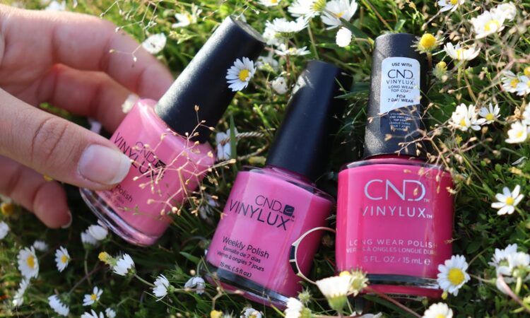
Consider the various shapes of nail polish bottles: some are sleek and cylindrical, while others are squat and rectangular. Each bottle shape communicates a distinct message to consumers. Tall, slender bottles might hint at elegance and refinement, appealing to those in pursuit of a luxurious touch. On the other hand, stout, wide bottles may evoke a sense of durability and practicality, targeting consumers who prioritize functionality.
Moreover, the ergonomic design of the bottle can also make an impact. A well-shaped bottle that fits comfortably in the hand can enhance the overall user experience, making it more likely for consumers to reach for that particular brand again in the future.
Color Psychology
Beyond the shape, the color of the nail polish bottle is equally significant. Colors have the power to evoke emotions and convey messages without saying a word. For example, a sleek black bottle may symbolize sophistication and mystery, while a vibrant red bottle exudes confidence and passion.
Moreover, color psychology plays a vital role in influencing consumer behavior. Different hues can trigger varied emotional responses, ultimately affecting purchasing decisions. For instance, soft pastel shades may evoke feelings of tranquility and peace, making them perfect for consumers desiring a serene experience. In contrast, bold, bright colors may instill a sense of excitement and adventure, appealing to those who crave novelty and vibrancy in their nail polish choices.
Brand Identity and Perception
The packaging of nail polish bottles also serves as a reflection of the brand’s identity and values. A sleek, minimalist design may convey a sense of modernity and sophistication, while a whimsical, colorful bottle may suggest creativity and playfulness. Consumers often gravitate towards brands that align with their personal values and aesthetic preferences, making packaging design a crucial component of brand perception.
Conclusion
In the world of beauty products, packaging is far more than just a vessel for the product—it’s a powerful tool for capturing attention, conveying messages, and influencing consumer behavior. The psychology behind nail polish bottle shapes and colors reveals the intricate ways in which packaging design impacts consumer choices. Whether it’s the elegant silhouette of a tall, slender bottle or the vibrant hues of a bold, colorful design, the packaging of nail polish plays a significant role in shaping consumer perceptions and driving purchasing decisions.
